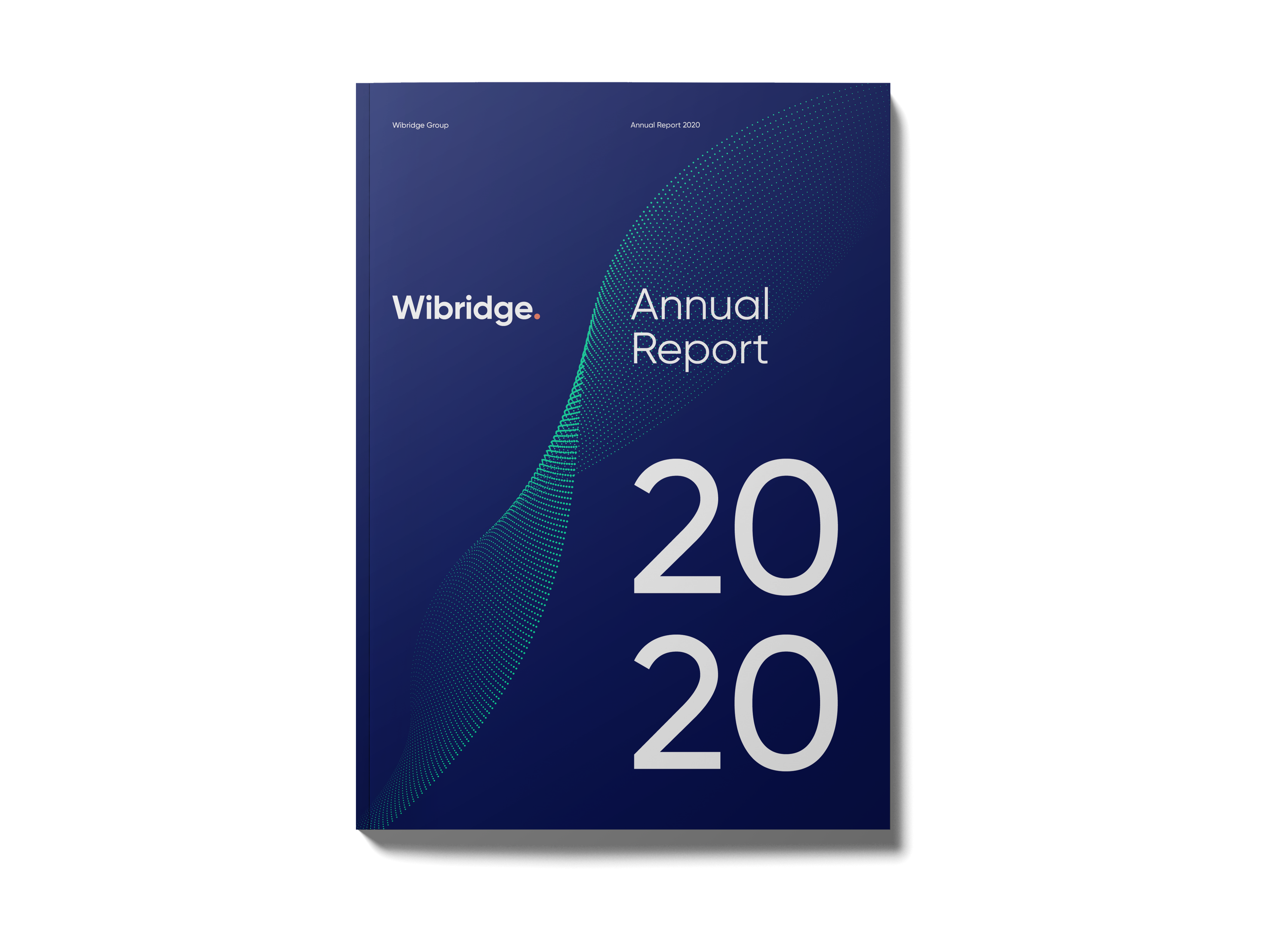
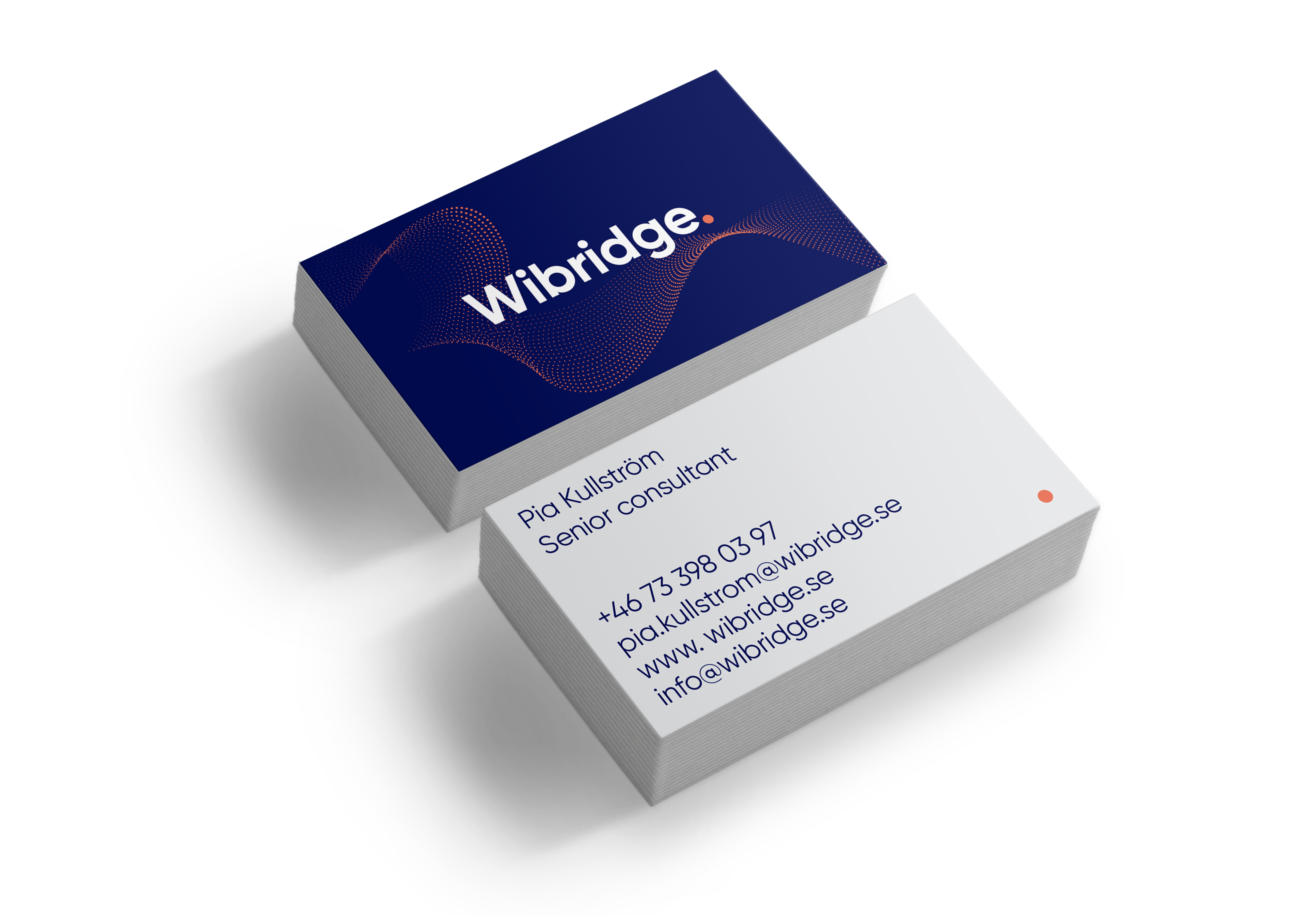
Wibridge is an independent advisory firm specializing in IT sourcing. They reached out to me requesting a new logotype, graphic identity, website, word & powerpoint template.
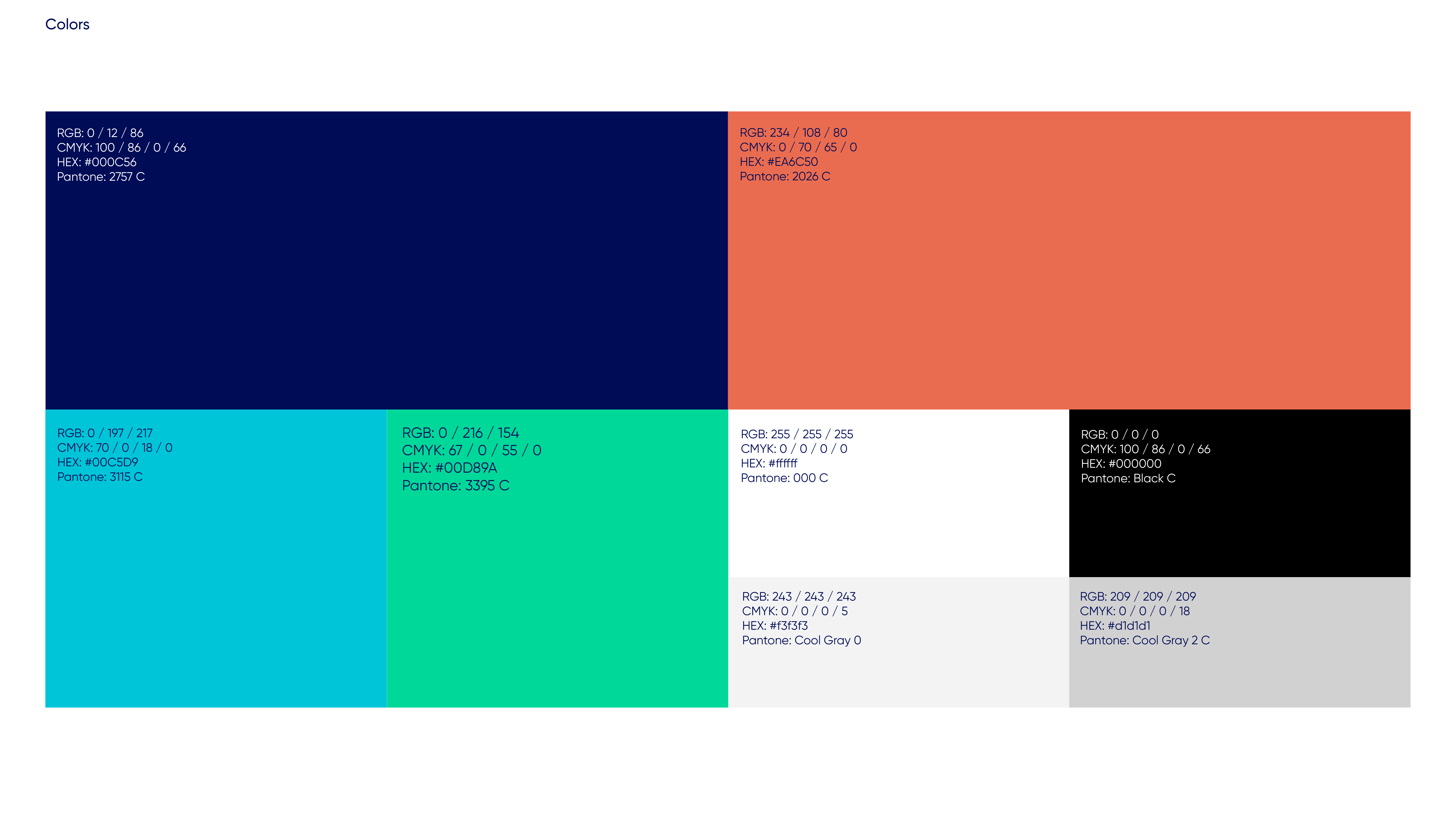
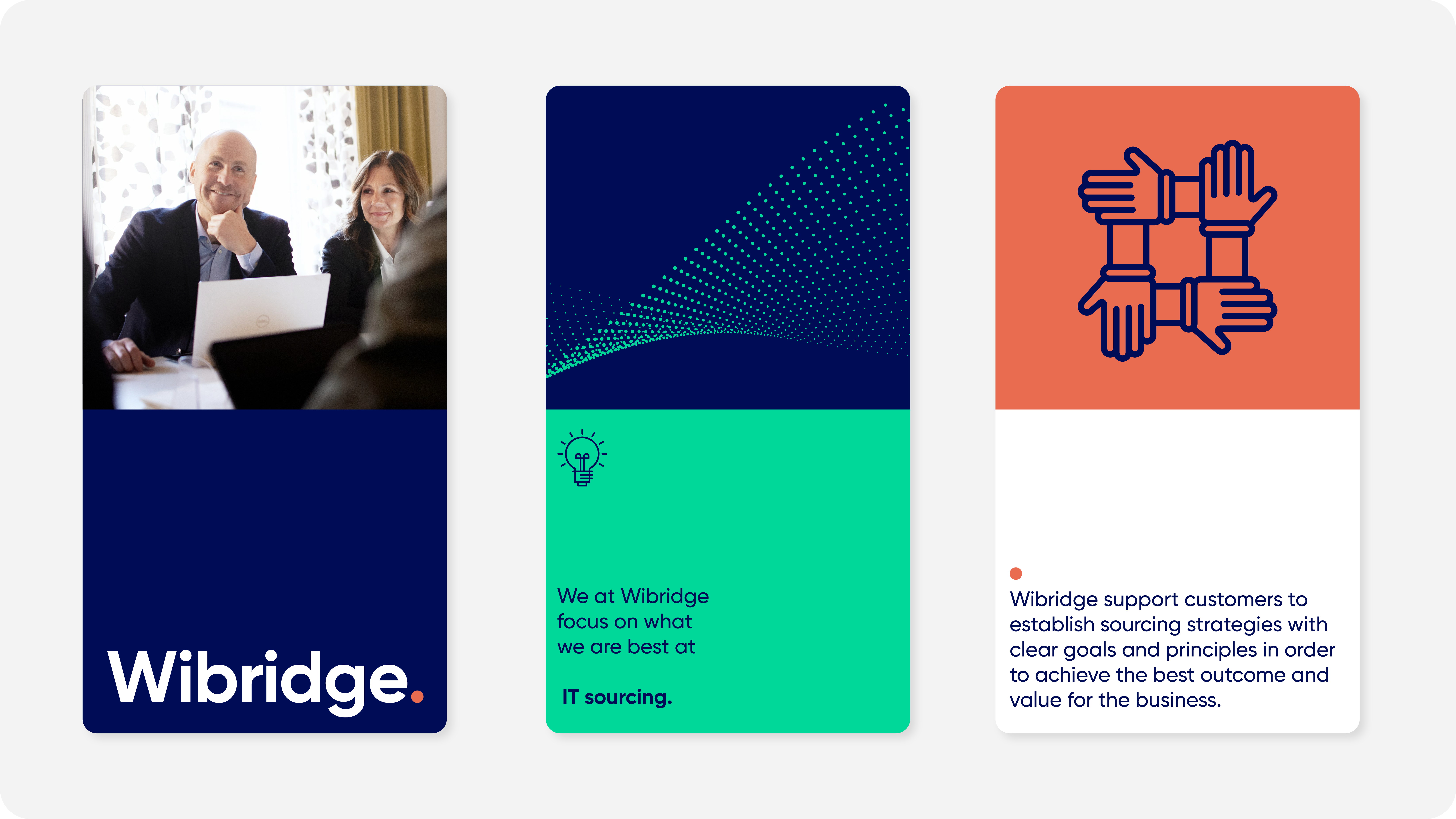
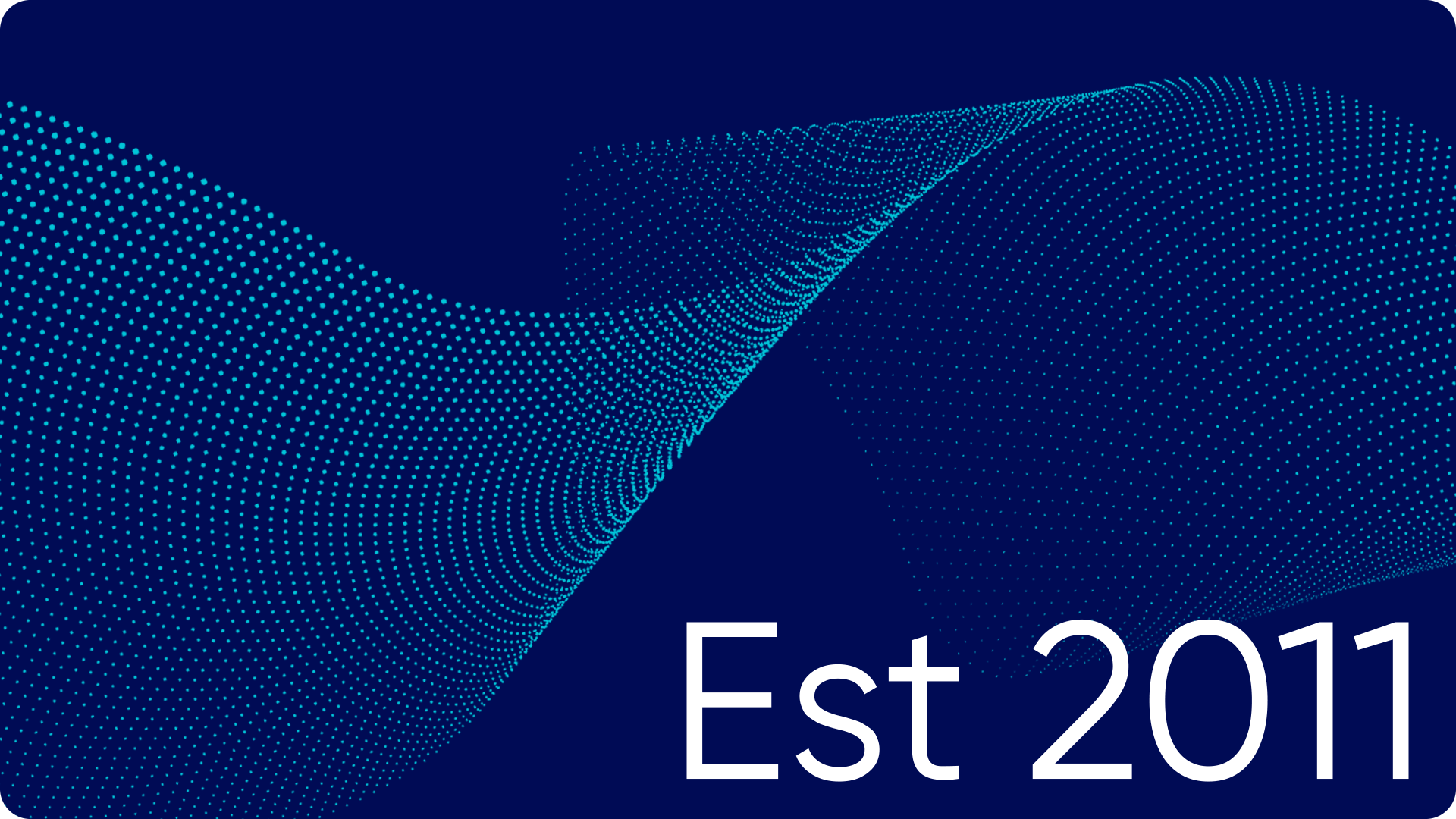
Being a relatively small player, Wibridge needed an identity that would position them as a reliable company within the IT sector. The identity is built upon the basic shape of a dot, symbolizing determination, efficiency and punctuality. The dot can then be brought out in a more playful manner, adapting and expanding depending on it’s need and situation.
Wibridge
—
REBRANDING
ART DIRECTION
MOTION DESIGN
UX DESIGN